Something that all social media managers need to get comfortable with is waking up on any given day and learning that Facebook has changed something without notice.
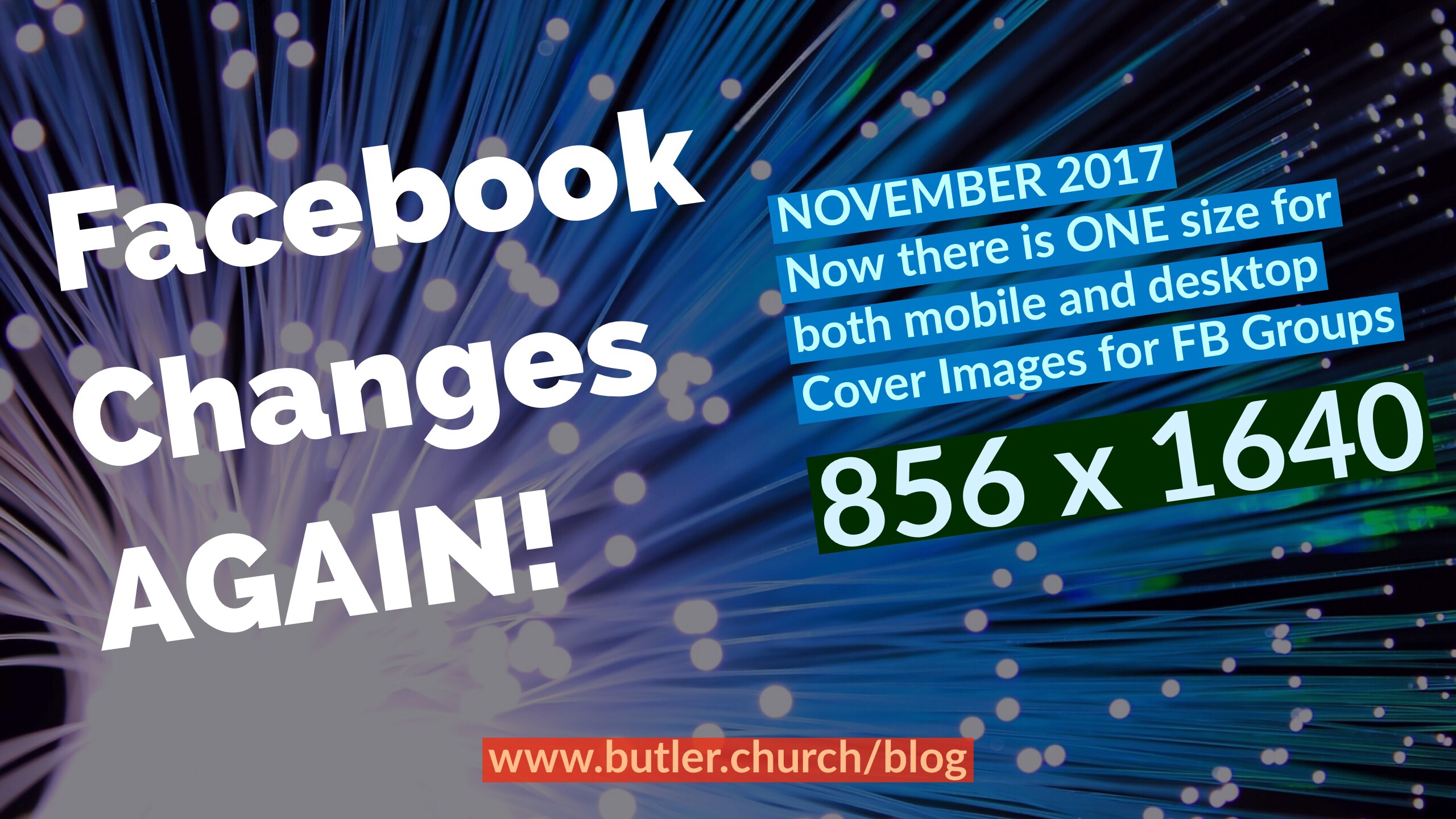
Sometimes it’s new features, sometimes it’s new functions, today, it is a new image size for Facebook Groups.
In concept, this is supposed to make it simpler for everybody, and also a better experience for the members.
Now you only need to worry about one size/ratio of images for your Facebook group cover image when designing it supposedly without worry about one view – mobile vs tablet vs desktop not displaying it properly or cropping off too much so it looks bad.
I think one of the annoying pieces for this kind of stuff is that Facebook does not make it easy for any social media manager to have a single place where they could reference all of these details at any given moment. Some of these things are not documented, some of these things are posted in FAQs and other places but never updated. So when you Google for them, you are led down a rabbit trail where you keep questioning if the image size information you have is the most current and up-to-date or not.
Anyway, here is the new info for the Facebook Cover Image size and dimensions:

Basically it is a 1 to 1.91 ratio for the image. Facebook specifically suggests 856×1640
This update was made NOVEMBER 2017
Let me know how it goes with your experience resizing your Facebook group cover image to this new image ratio. Does it work? Any tips to share with other social media managers reading this?


Recent Comments